Good day everyone, I am currently working on creating a chat Icon for the fedora documentation team and I’d like to get your opinions on my current sketches. Which ones do you prefer, what adjustments can I make and are they simple enough.

4 Likes

2 Likes
I like (2), the Fedora icon pops out immediately to my eyes.
2 Likes
I really like the ones in the second column. The text lines are a nice touch.
I prefer the ones with the ticker magnifying glass (2 and 3 on the right).
The book on them looks more like a journal or a piece of folded paper. I think it could be better with some more lines to make it more like a book full of pages and with a hardcover. Like you did on 1 & 2, but open.
Does that make sense?
Great work anyway ![]()
1 Like
@darknao Yes it does make sense, would make some adjustments.
Hi @darknao Kindly checkout this iterations.
1 Like
Looks great!
My fav is still #1. #3 and #4 feel a bit small and it looks like the text lines on #3 are not aligned with each other.
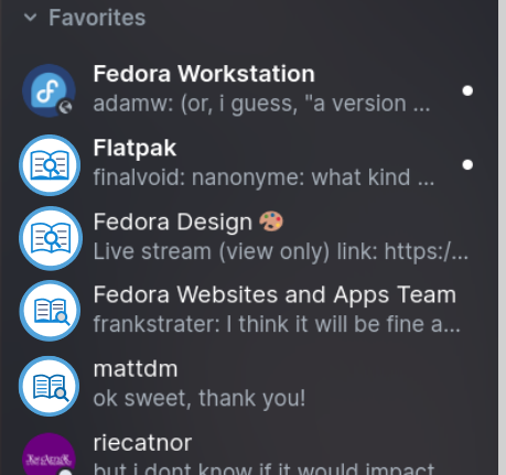
Now that I see them in context, and not sure if it’s related to the dark theme used on your screenshot, but I feel like there is too much contrast between the icon and the background.
I’m not sure how to address that, but what if, and that is just an idea, you “zoom in” a bit more on the book to reduce the amount of white space around it, even if the edge goes a bit outside of the visible space, but not too far so we can still see that it’s a book.
You could even tilt the book a little bit, and/or move the magnifying glass a bit on the side, just to see if a small amount of chaos can bring more life to the icon.
I’m just throwing ideas here, I’ve no idea if that will look good or not ![]()
2 Likes
Thank you, will see if I can make some adjustments.
#1 - Fedora icon itself is in a “speaking bubble” shape .