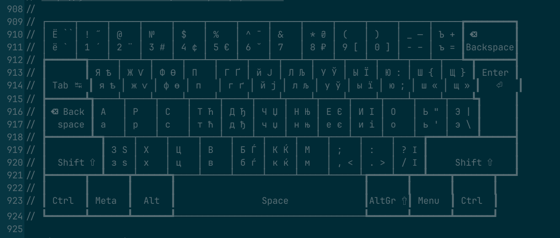
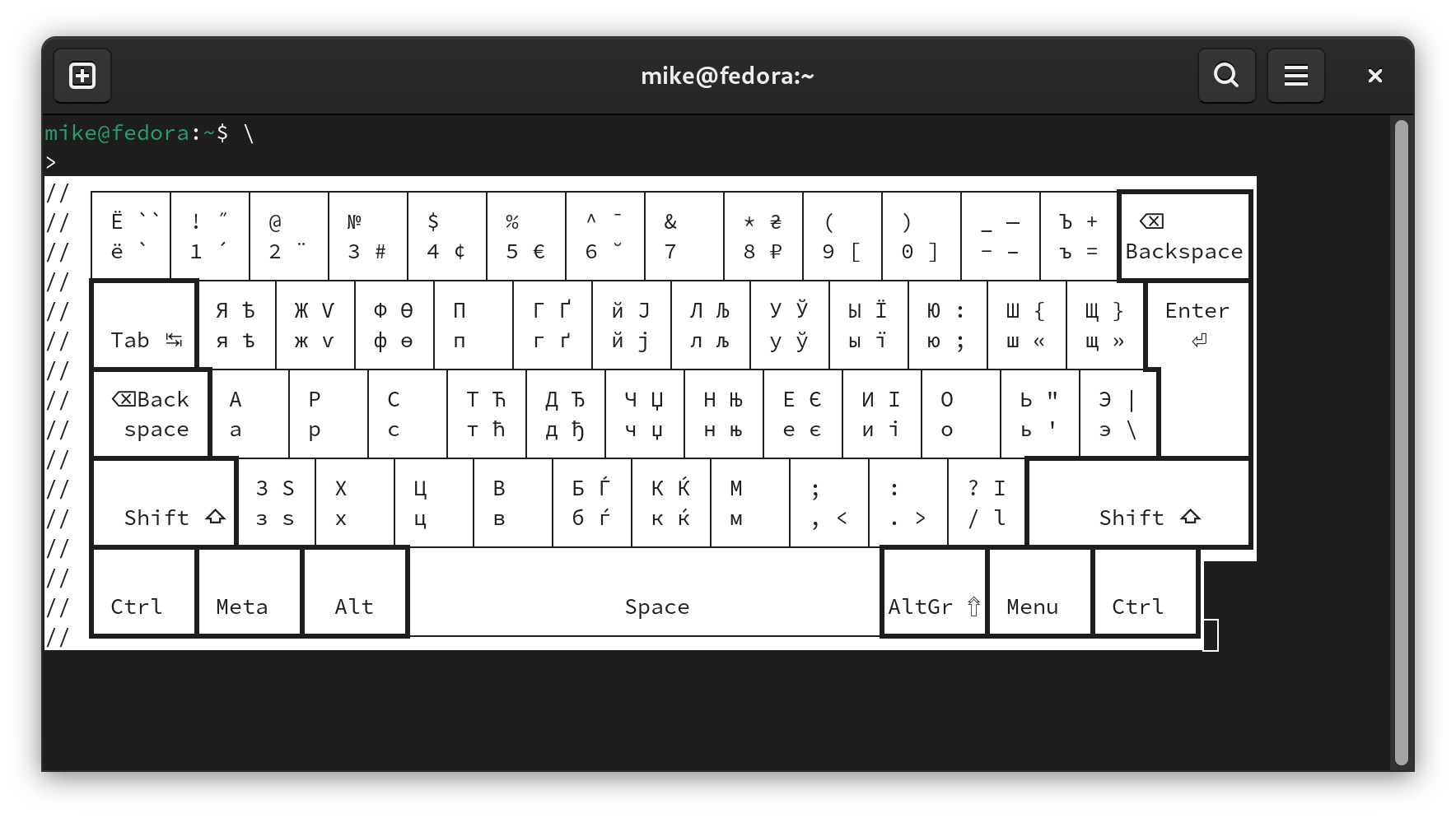
I’m editing a file in gedit, and there is a semigraphic schematic of a keyboard. Some characters being a bit wider than others ruins the whole picture.
Maybe if you could paste the schematic keyboard as text (preformatted by pressing the </> button, or by hitting Ctrl-E after the text is selected), we could take a look.
This is a cool project ! I have some use for this as I am trying to collate all my most used application’s keyboard shortcuts into a easily visual representation.
I think the issue isn’t with the font itself, but rather with how the text editor manages character rendering. In this case, text editor is optimized to enhance readability. However, terminal emulators do not apply these optimizations.
For example, consider the character ⌫: In the terminal, multiple instances of this character can appear crushed together.
However, text editor adjusts the spacing to make each character distinct and easier to read.
A workaround is to select a font that renders symbols in a smaller size to accommodate special characters more effectively. I recommend testing through some monospaced fonts here: